

Mor Furniture
2022 Graphic Design Intern
2023—2024 Contract Graphic Designer
2025—2026 Graphic & Creative Designer
Mor Furniture is a west coast home furniture retailer with 40 stores in 7 states. The mission is to improve people’s daily lives by bringing them affordable furniture to make their living spaces feel like home.
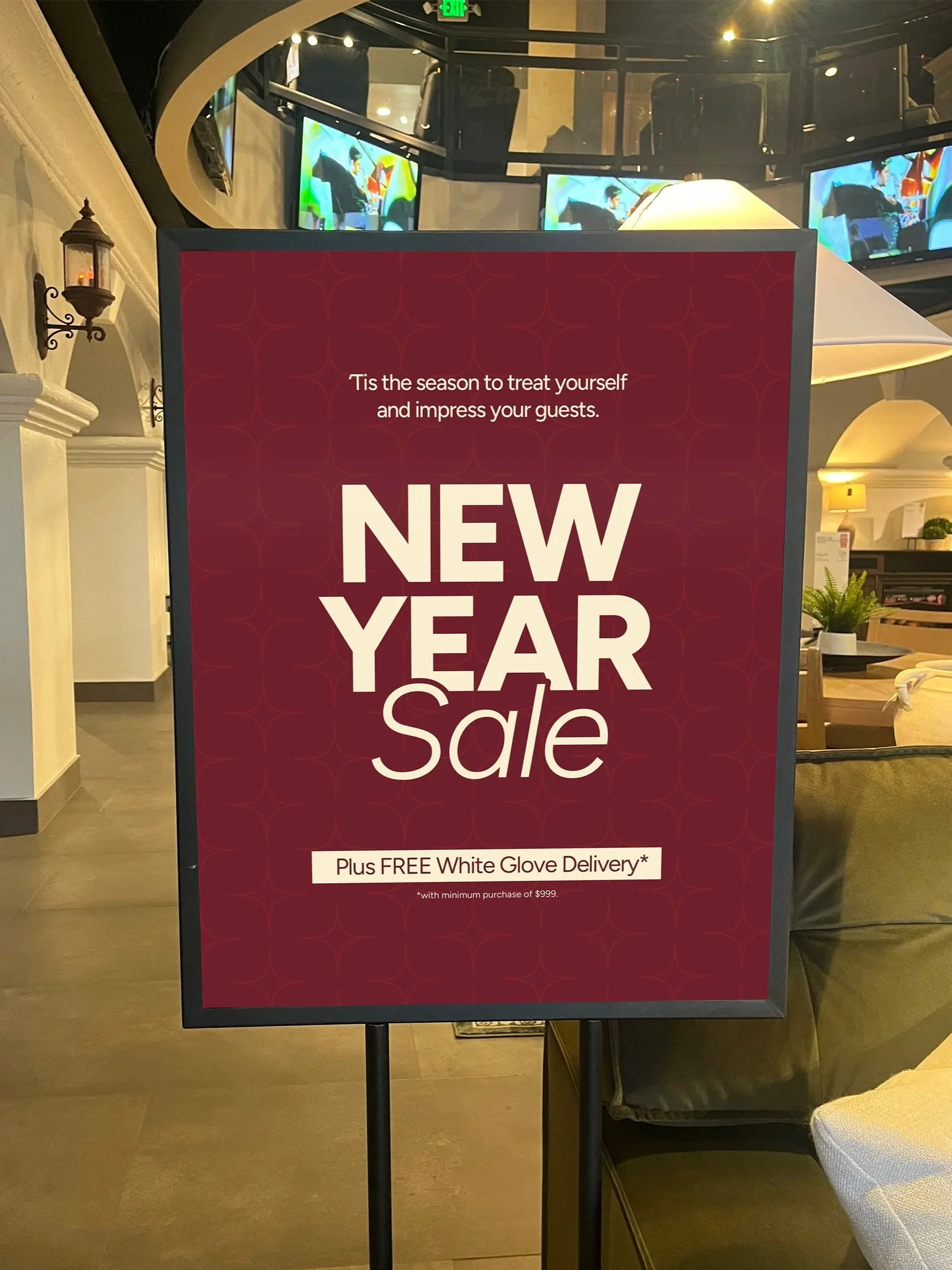
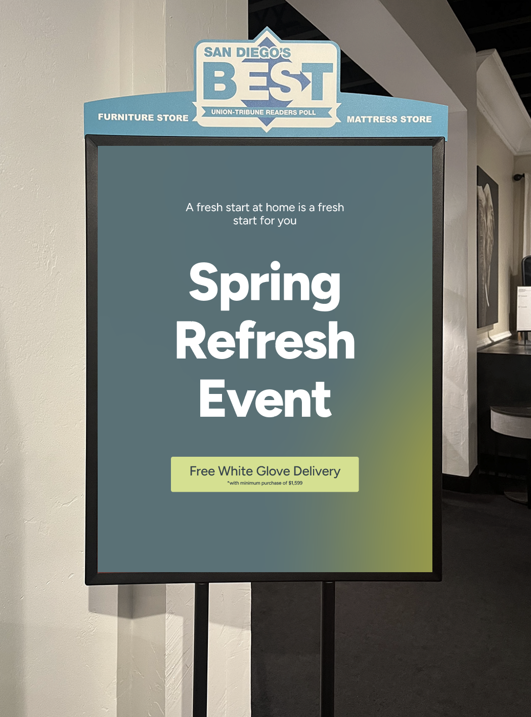
Promotional Campaigns
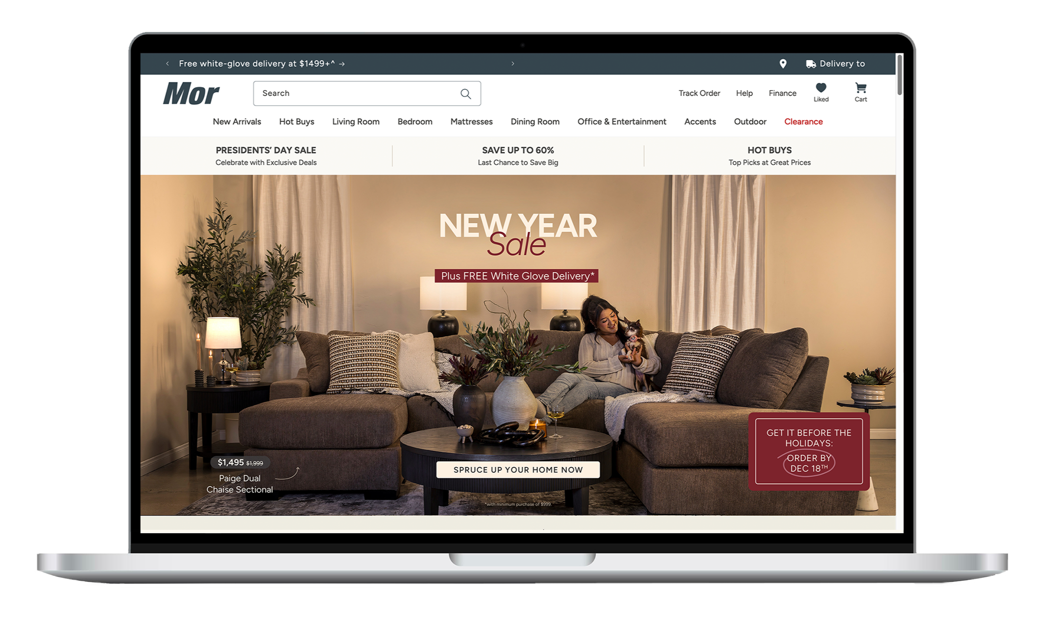
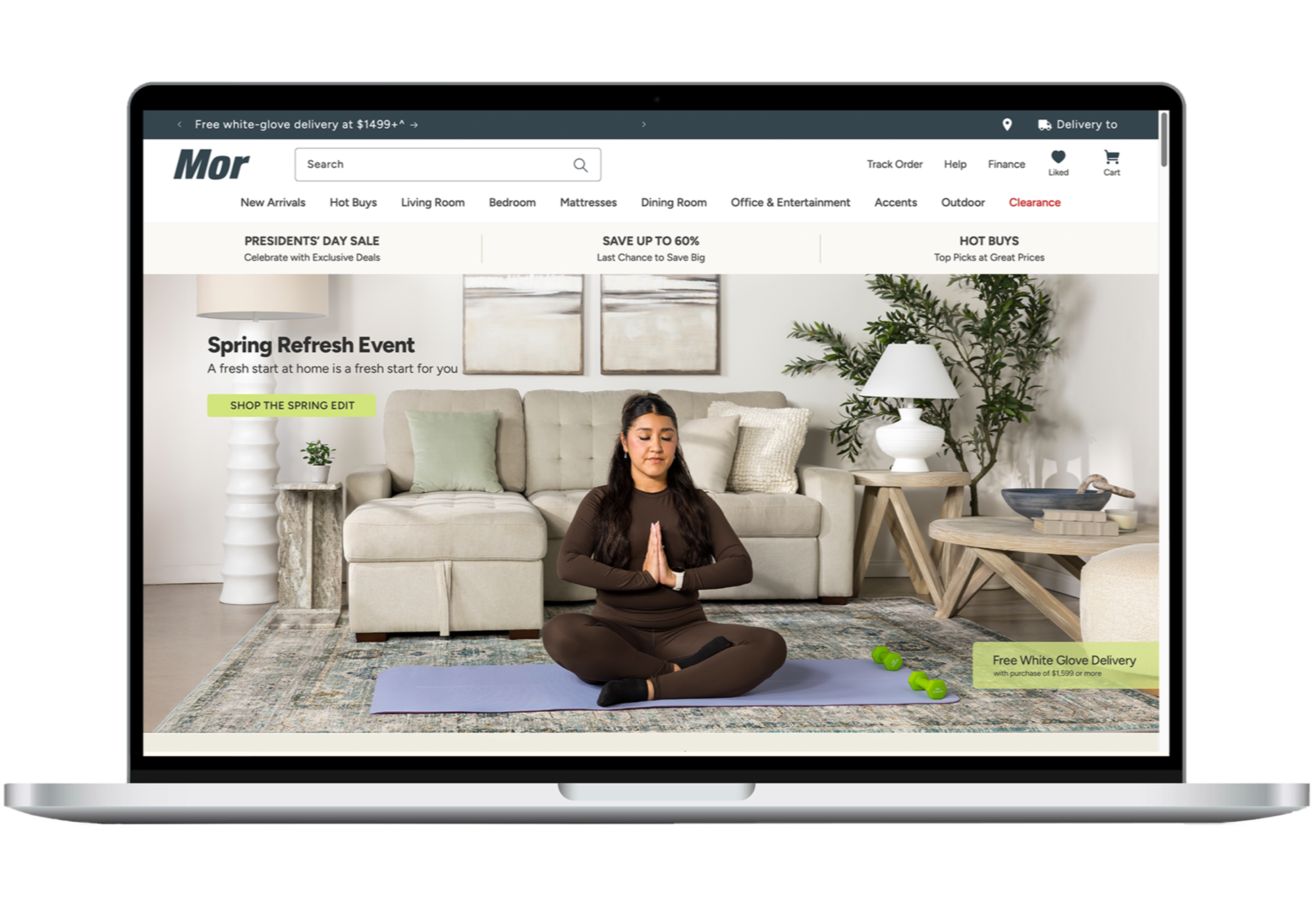
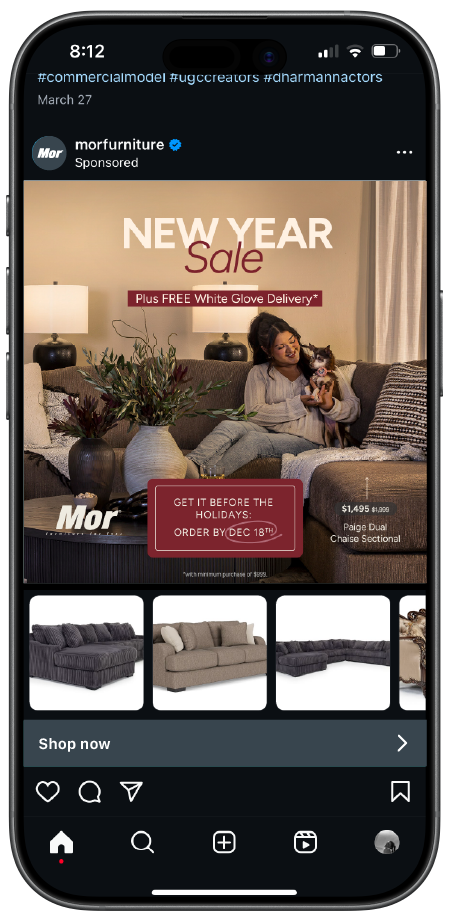
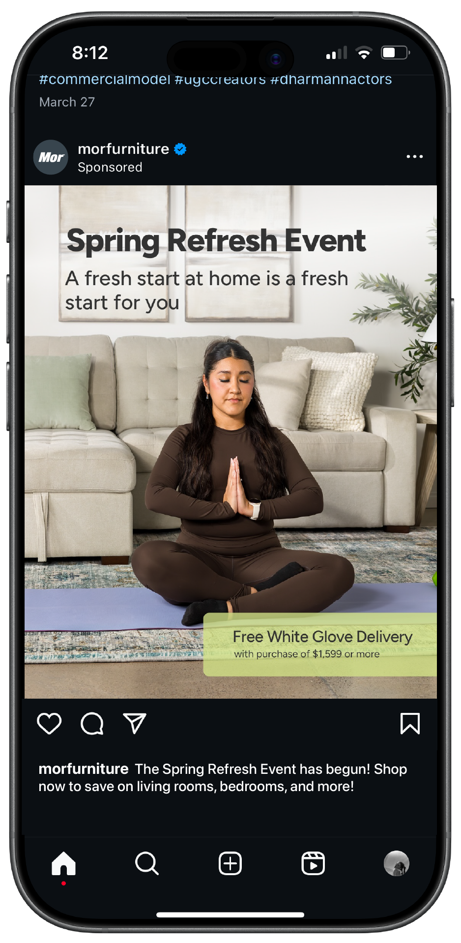
For each promotion, we lead with strategy based on consumer behavior, historical insights, SEO observations, and competitor analysis. These insights inform the design direction and look & feel.
New Year Sale


Increasing brand reach & engagement
Up to $4M in sales in 1 weekend
Spring Refresh Event
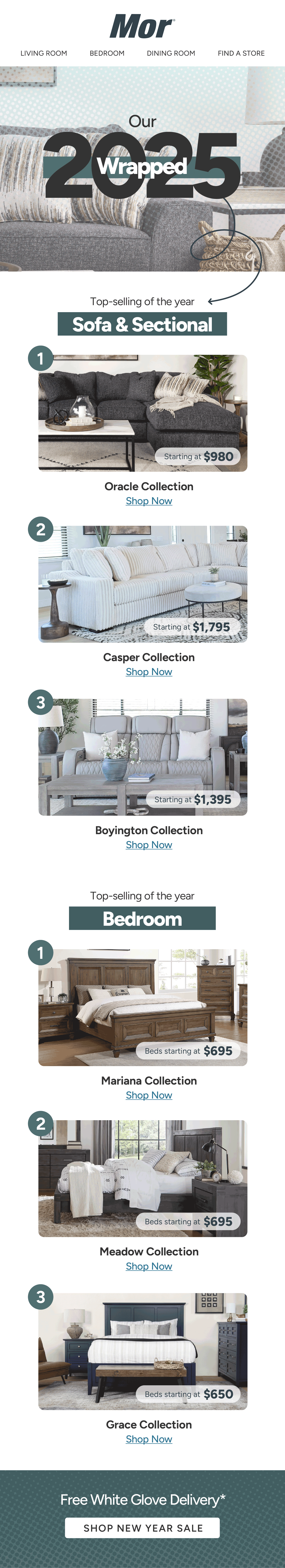
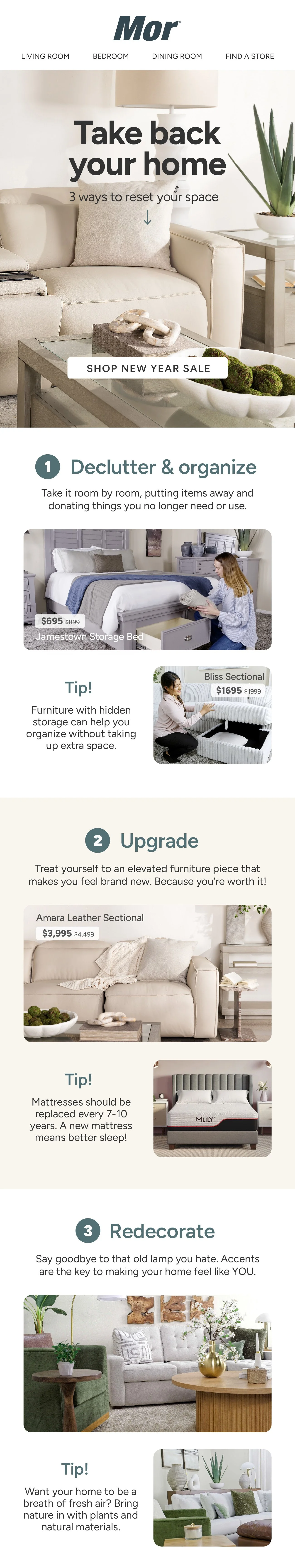
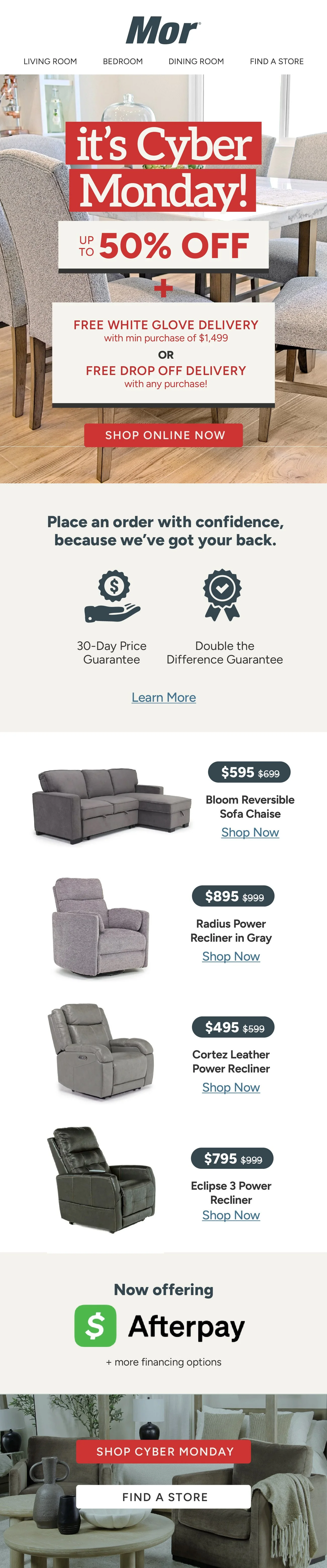
Our email marketing is catered to strategic segments of our audience who we target based on email engagement, website activity, purchasing patterns, and customer interests. We send out a variety of content types, such as collection spotlights, promotional reminders, and editorial-style emails focused on style or trends.
Email Marketing
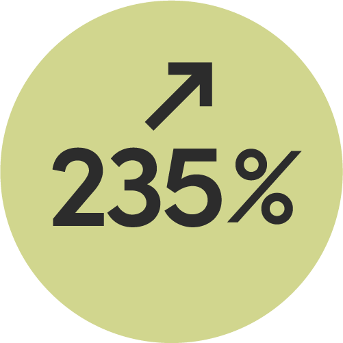

attributed revenue in campaigns this holiday season, compared to prev yr
attributed revenue in flows this year, compared to prev yr
Visual Branding
In the past couple months, I gave Mor’s branding a much-needed refresh to make it feel more sophisticated and contemporary. It has made a remarkable difference in our visual presence and public perception.