
Abuelo’s Orchard
Abuelo’s Orchard is a tequila bottle label design with an augmented reality component. The identity of the label explores my immigrant family’s history of citrus picking in Southern California.
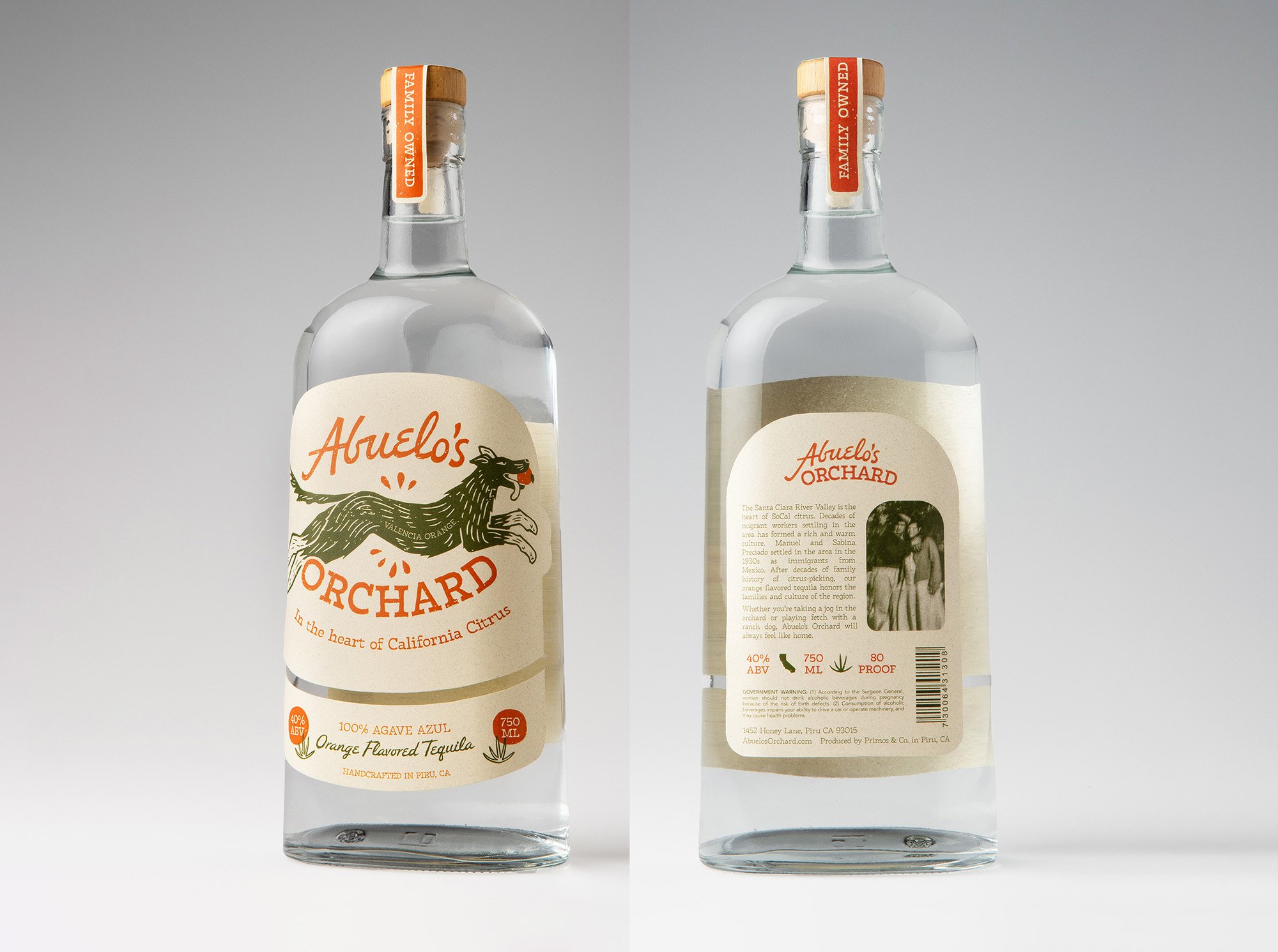
Using handmade-looking illustration and typography styles, the label feels family owned and lovingly made. It takes from the warmth my own childhood memories, which I hope is imparted through the design.
Story & Process


My great-grandparents Manuel and Sabina Preciado immigrated from Jalisco, Mexico (the tequila capitol!) in the 1930s. After moving around California with the seasons as a migrant citrus worker, Manuel met Sabina and they married, settling in Piru, California.
They lived on a ranch with an orange orchard, continuing the citrus legacy. The ranch has been passed down two more generations. What a special place for our family!
This area of California has become rich with culture as many more families from Mexico settled and grew there.

Growing up, going to the ranch was my favorite thing to do when visiting family. And one of my favorite parts about the ranch was the ranch dogs. They run around, protecting the land from coyotes and accompanying us in our adventures. The dogs become a special part of the family.
Luna is pictured here trotting along with us on our walk to the creek.


Another cool part of SoCal’s citrus history is the printed labels. These were created back in the day for the orange crates that would be transported and sold. They were designed with unique serif typefaces, curved type, and combinations of serifs and handwritten fonts. Not to mention the illustrations of oranges and the motifs referencing the unique characteristics of the land.


In the first stages of designing this tequila label, I brainstormed ways to include these multiple elements of the family story, the uniqueness of the location, the history of the area, and the retro orange crate labels.
I took inspiration from the labels’ mix of typography styles, wanting the typography to also feel warm and handmade.
With obvious references to oranges, I settled on using a dog as a mascot to bring in the special family feel and the uniqueness of my family’s ranch.
Voilà!

Augmented Reality
I couldn’t stop at a printed label. The augmented reality component gives the user more insight into the brand’s identity. With 3D framed photos of family members, the frames flip when the user taps, providing more info on the backs of the frames. This acts as a timeline of the ranch and my family history. This additional storytelling helps the consumer feel more connected to the brand and the people behind it.